/* Primitives & shared marks for the heARTist UI kit */
const { useState } = React;
/* ---- Hand-lettered wordmark (SVG file) ---- */
function Logo({ height = 30, invert = false }) {
return (
);
}
/* ---- Signature (same hand-lettered mark, used in body copy as her sign-off) ---- */
function Signature({ height = 56, invert = false, tilt = -3, style = {} }) {
return (
);
}
/* ---- Yellow ribbon mark (simple drawn loop, not emoji) ---- */
function Ribbon({ size = 18, color = 'var(--ribbon)' }) {
return (
);
}
function Button({ children, kind = 'ink', onClick, type, style }) {
const [press, setPress] = useState(false);
const [hover, setHover] = useState(false);
const base = {
fontFamily:'var(--font-sans)', fontWeight:700, fontSize:15, lineHeight:1,
border:'1.5px solid transparent', borderRadius:'var(--radius-sm)', padding:'13px 24px',
cursor:'pointer', letterSpacing:'.01em', position:'relative', overflow:'hidden',
transition:'transform .18s cubic-bezier(.34,1.56,.64,1), box-shadow .22s ease, background .18s ease, filter .18s ease',
display:'inline-flex', alignItems:'center', gap:9, willChange:'transform',
};
const kinds = {
ink: { background:'var(--ink)', color:'var(--paper)' },
yellow: { background:'var(--ribbon)', color:'var(--ink)' },
red: { background:'var(--marker-red)', color:'#fff' },
ghost: { background:'transparent', color:'var(--ink)', borderColor:'var(--ink)' },
quiet: { background:'transparent', color:'var(--graphite)', padding:'13px 6px' },
};
const lift = {
ink: '0 10px 22px rgba(20,17,15,.22)',
yellow: '0 10px 22px rgba(200,146,10,.30)',
red: '0 10px 24px rgba(200,54,43,.30)',
ghost: '0 8px 18px rgba(20,17,15,.12)',
quiet: 'none',
};
const hovered = hover && kind!=='quiet'
? { transform:'translateY(-2px)', boxShadow:lift[kind], filter:'brightness(1.04)' } : {};
const pressed = press
? { transform:'translateY(1px) scale(.98)', boxShadow:'inset 0 2px 5px rgba(20,17,15,.22)', filter:'none' } : {};
return (
);
}
/* ---- Minimalist line icons — one thin marker stroke, rounded caps.
Inherit color via currentColor; sized in px. ---- */
function CloseIcon({ size = 18, strokeWidth = 1.6 }) {
return (
);
}
function Chevron({ size = 22, dir = 'left', strokeWidth = 1.7 }) {
const d = {
left: 'M15 5 L8 12 L15 19',
right: 'M9 5 L16 12 L9 19',
down: 'M5 9 L12 16 L19 9',
up: 'M5 15 L12 8 L19 15',
}[dir] || 'M15 5 L8 12 L15 19';
return (
);
}
/* Tag — a small solid label pill. Replaces the old tracked-uppercase eyebrow:
sentence case, filled (not outlined), reads modern and substantial. */
function Eyebrow({ children, color }) {
const red = color === 'var(--marker-red)';
return {children};
}
/* status → look */
const STATUS = {
held: { label:'Still held', dot:'var(--ribbon)', text:'var(--ink)' },
returned: { label:'Home', dot:'var(--hope)', text:'var(--hope)' },
memory: { label:'ז״ל', dot:'var(--memory)', text:'var(--memory)' },
};
function StatusTag({ status }) {
const s = STATUS[status];
return (
{s.label}
);
}
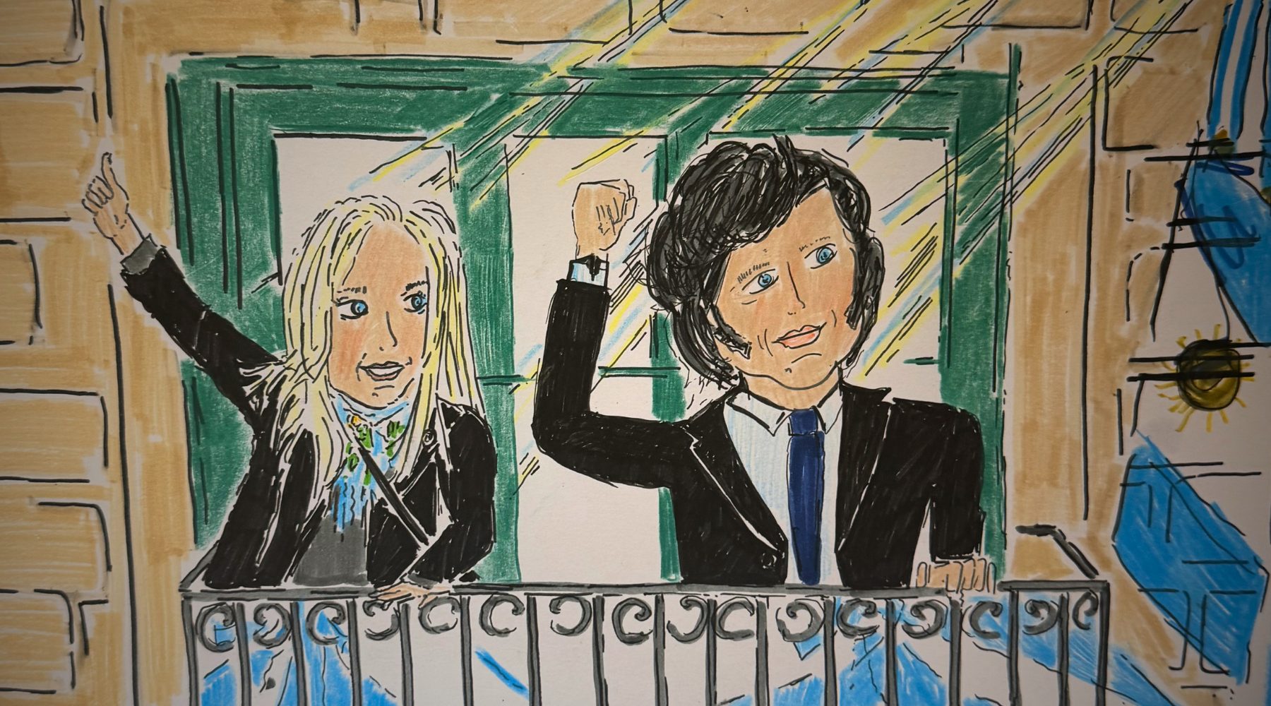
/* ---- Portrait placeholder: a marker portrait slot ----
Honest stand-in for Naomi's real drawing. Paper ground, faint
line figure, top-right status tag + bottom color strip (unified
across statuses — only the color changes). */
function Portrait({ person, size = 'md' }) {
const s = STATUS[person.status];
const tagText = person.tag || s.label;
return (
{tagText}
);
}
Object.assign(window, { Logo, Signature, Ribbon, Button, Eyebrow, StatusTag, Portrait, STATUS, Reveal, ScribbleUnderline, CloseIcon, Chevron, HeroBackdrop });
/* --- HeroBackdrop: the same faded, slowly-cycling marker imagery used in the
home hero. Drop it as the first child of a position:relative / overflow:hidden
section, and lift the section's content above it with z-index. Reuses the
.ng-hero-bg animation + veil from the global stylesheet. --- */
function HeroBackdrop({ veilClass = 'ng-hero-veil' }) {
return (
);
}
/* --- Reveal: fades + lifts content in as it scrolls into view. Uses the
`delay` prop (previously inert) to stagger groups. Falls back to fully
visible when reduced-motion is on or IntersectionObserver is unavailable. */
function Reveal({ children, delay = 0, as: As = 'div', style = {}, className }) {
const ref = React.useRef(null);
const [shown, setShown] = React.useState(false);
React.useEffect(() => {
const el = ref.current; if (!el) return;
if (window.matchMedia && window.matchMedia('(prefers-reduced-motion: reduce)').matches) { setShown(true); return; }
if (!('IntersectionObserver' in window)) { setShown(true); return; }
const io = new IntersectionObserver((entries) => {
entries.forEach(e => { if (e.isIntersecting) { setShown(true); io.disconnect(); } });
}, { rootMargin: '0px 0px -8% 0px', threshold: 0.08 });
io.observe(el);
return () => io.disconnect();
}, []);
return (
{children}
);
}
/* --- ScribbleUnderline: animated marker line under a word.
Stretches to fill its container (the word it underlines) on every screen size. --- */
function ScribbleUnderline({ width = '100%', height = 18, color = 'var(--marker-red)', delay = 200 }) {
const ref = React.useRef(null);
React.useEffect(() => {
const p = ref.current; if (!p) return;
if (window.matchMedia('(prefers-reduced-motion: reduce)').matches) { p.style.strokeDashoffset = 0; return; }
const len = p.getTotalLength(); p.style.strokeDasharray = len; p.style.strokeDashoffset = len;
const t = setTimeout(() => { p.style.transition = 'stroke-dashoffset 1.1s cubic-bezier(.4,.7,.2,1)'; p.style.strokeDashoffset = 0; }, delay);
return () => clearTimeout(t);
}, [delay]);
return (
);
}
 );
}
/* ---- Signature (same hand-lettered mark, used in body copy as her sign-off) ---- */
function Signature({ height = 56, invert = false, tilt = -3, style = {} }) {
return (
);
}
/* ---- Signature (same hand-lettered mark, used in body copy as her sign-off) ---- */
function Signature({ height = 56, invert = false, tilt = -3, style = {} }) {
return (